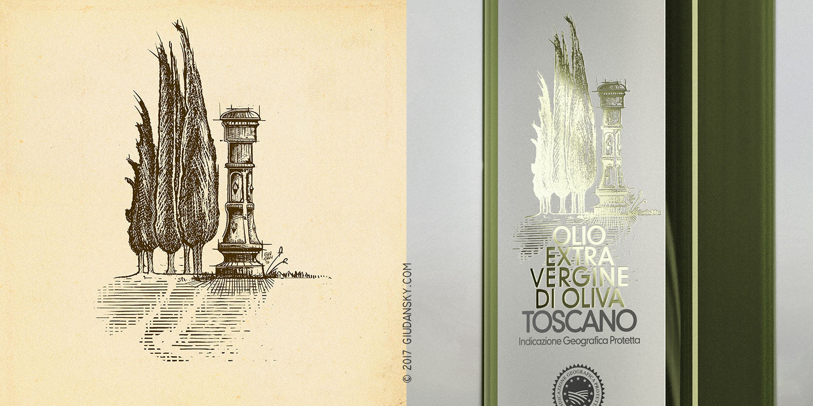
From the paper, to the brass, to the paper again. The long path of this label graphic design, across different materials to the final label work: paper, pixels, brass, golden lamina, and finally, the paper again. And then on a glass bottle filled with Bio Extravirgin Olive Oil.
Everything started with a hand draw engraving illustration; it was digitalized and refined with digital tablet. Then sent to the typography which made a mirrored brass replica. This wonderful shining plate, is needed to impress the golden lamina on the laid paper, with an incredible level of detail.
The master brass cliché is a great piece of jewel, maybe even better than the final label itself.


")
Follow me for updates or contact me on the socials